These are my final thoughts on the webart design project:
I am beginning my website with a picture of my hand that is multicolored and filtered to create the thought of difference in identities that I have in my life. The rest of the graphics and flash products in my website have ideas that create descriptions of my different identities. My general identities are when I'm with my girlfriend, with my family, my danger/adventurous identity, and my school/studying identity. The graphics that I have, have a theme of darkness and lightness depending on the modd of the identity. The other pictures compliment these light and darknesses.
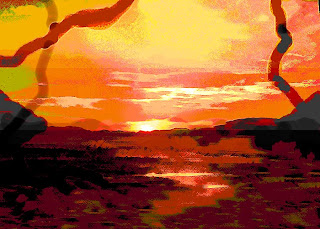
It all tops off with a final picture that combines light and darkness over the horizon during a sunset. The light and darkness are separated, yet they are combined by the earth. They are separated enough for someone to notice the difference, yet they are altered enough to prove the difference in identities. During my presentation tomorrow, I will more thoroughly describe how each page and graphic represent the specific identities. I am very proud of this website because this is the first time that I have ever touched photoshop, dreamweaver, and flash, not even saying that I have never heard of them before. I know that all of these skills that I learned during this class will actually help me at some point during my career. Now that I know that I can create a website, this is another skill that helps me to improve. I also didn't realize how much art you could really create on photoshop from simple photographics and graphics. I completely changed so many things into art on photoshop, now I know that I can use these skills in school when I get back home. The art that I created can be incorporated with science and other skills that I have.
Tuesday, June 3, 2008
Monday, June 2, 2008
Light and Dark
Here the final graphic that I am going to add to my website. It does a good job summing up the website, and my identity, as well as everyone's identity. On the horizon during a previous, yet altered sunset, there is a distinction between light and dark. The sky is very light, and the ground is very dark. They match as one identity, yet they don't blend very well to prove the difference between light and darkness. All of the pages on my website speak about the different identities of my life. Many have to do with light or darkness, as well as blending and combining ideas.


Sunday, June 1, 2008
Final Graphic
So I was thinking that I really needed to finalize this website, and the best way to do it is to create one more graphic that will contrast the dark side of everyone to the light and mysterious side. I found a good picture that I have taken a while ago, and am going to filter it between the horizon to contrast the two sides that everyone has. As I am working on it right now, I will post an idea later on today. But the simple idea is to contrast the two sides between the horizon
Thursday, May 29, 2008
Final touches
At this point after the last class, I think that I am pretty much done with my website. At most I may be adding one more page or something. But I am pretty satisfied with my newly found abilities to create graphics on photoshop and flash applications when I had never heard of either of these programs before. Below is my last photoshop graphic created so far. This represents more of my dangerous and daring identity. I took a photograph that I had of spinning fire, and altered it to created brighter and firery colors. I also created a cool text from a tutorial online on how to make fire looking graphics on photoshop. I also added in the Sydney bridge to bring in a little of the culture, and my identity to travel, which incorporate into the daring part of my identity. The bridge is high, and something that would be daring to bungee off of, or even to climb.

I also added background color, a simple gray to not take away from my graphics. This made the website have more unity. The last class was used to tidy up everything. At this point I think I am done with my website. I wish that we were taught how to put on music because I would have liked to have done so. But I guess we ran out of time.

I also added background color, a simple gray to not take away from my graphics. This made the website have more unity. The last class was used to tidy up everything. At this point I think I am done with my website. I wish that we were taught how to put on music because I would have liked to have done so. But I guess we ran out of time.
Monday, May 26, 2008
links
I have been creating more pages for my website, and also combining these pages on dreamweaver. I like how the rollovers work, so I have used that for the front page with my multicolored hand, and I am also going to use it in various other places on the website. Here are two other pages that I have been working on this week. This first page below represents how distant from my family I am right now being on the other side of the world. I crazy colors of space just makes the graphic more interesting, and I made the word distant bend so that it looks like the middle of it is disappearing into the distant space. This is part of my family identity because of how I miss them, and how far away I am now.

This next graphic represents my identity at school. The transparent pencil that I have blended into the background will be made into a flash so that it is writing on the paper. I also included bright colors and alterations to the picture because I love being at school. I am happy at school, and have some of my best times there. The bright and happy colors prove this.


This next graphic represents my identity at school. The transparent pencil that I have blended into the background will be made into a flash so that it is writing on the paper. I also included bright colors and alterations to the picture because I love being at school. I am happy at school, and have some of my best times there. The bright and happy colors prove this.

Saturday, May 24, 2008
new graphics
This graphic that I made here is to describe my identity of fear and exploration for extreme. This is the platform of an area that I bungee jumped. The picture is made darker by filters and gradients so show fear. The anxiousness turns into fear and adrenaline. This identity has been in control a lot in my recent few months.


Tuesday, May 20, 2008
two new photoshop works
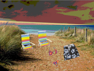
Here are two other works that I am working on in photoshop. Niether one is done yet, but they are the general idea. The beach one is used to explain my identity with my girlfriend. This is a relaxing identity, where nothing else matters on the beach, but the sky is an abnormal color to produce the effect of unpredictable relationships.

The other is a beginning piece of work to represent my family identity. This will have a few slides, but this first graphic represents the beginning of my life. This contrasts to where I am in my life now in Australia because the city is in the background. It is darker because I am not with my family right now so in a way it is ironic.


The other is a beginning piece of work to represent my family identity. This will have a few slides, but this first graphic represents the beginning of my life. This contrasts to where I am in my life now in Australia because the city is in the background. It is darker because I am not with my family right now so in a way it is ironic.

Subscribe to:
Comments (Atom)