These are my final thoughts on the webart design project:
I am beginning my website with a picture of my hand that is multicolored and filtered to create the thought of difference in identities that I have in my life. The rest of the graphics and flash products in my website have ideas that create descriptions of my different identities. My general identities are when I'm with my girlfriend, with my family, my danger/adventurous identity, and my school/studying identity. The graphics that I have, have a theme of darkness and lightness depending on the modd of the identity. The other pictures compliment these light and darknesses.
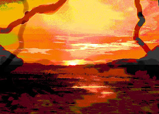
It all tops off with a final picture that combines light and darkness over the horizon during a sunset. The light and darkness are separated, yet they are combined by the earth. They are separated enough for someone to notice the difference, yet they are altered enough to prove the difference in identities. During my presentation tomorrow, I will more thoroughly describe how each page and graphic represent the specific identities. I am very proud of this website because this is the first time that I have ever touched photoshop, dreamweaver, and flash, not even saying that I have never heard of them before. I know that all of these skills that I learned during this class will actually help me at some point during my career. Now that I know that I can create a website, this is another skill that helps me to improve. I also didn't realize how much art you could really create on photoshop from simple photographics and graphics. I completely changed so many things into art on photoshop, now I know that I can use these skills in school when I get back home. The art that I created can be incorporated with science and other skills that I have.
Tuesday, June 3, 2008

Monday, June 2, 2008
Light and Dark
Here the final graphic that I am going to add to my website. It does a good job summing up the website, and my identity, as well as everyone's identity. On the horizon during a previous, yet altered sunset, there is a distinction between light and dark. The sky is very light, and the ground is very dark. They match as one identity, yet they don't blend very well to prove the difference between light and darkness. All of the pages on my website speak about the different identities of my life. Many have to do with light or darkness, as well as blending and combining ideas.

Sunday, June 1, 2008
Final Graphic
So I was thinking that I really needed to finalize this website, and the best way to do it is to create one more graphic that will contrast the dark side of everyone to the light and mysterious side. I found a good picture that I have taken a while ago, and am going to filter it between the horizon to contrast the two sides that everyone has. As I am working on it right now, I will post an idea later on today. But the simple idea is to contrast the two sides between the horizon
Thursday, May 29, 2008
Final touches
At this point after the last class, I think that I am pretty much done with my website. At most I may be adding one more page or something. But I am pretty satisfied with my newly found abilities to create graphics on photoshop and flash applications when I had never heard of either of these programs before. Below is my last photoshop graphic created so far. This represents more of my dangerous and daring identity. I took a photograph that I had of spinning fire, and altered it to created brighter and firery colors. I also created a cool text from a tutorial online on how to make fire looking graphics on photoshop. I also added in the Sydney bridge to bring in a little of the culture, and my identity to travel, which incorporate into the daring part of my identity. The bridge is high, and something that would be daring to bungee off of, or even to climb.

I also added background color, a simple gray to not take away from my graphics. This made the website have more unity. The last class was used to tidy up everything. At this point I think I am done with my website. I wish that we were taught how to put on music because I would have liked to have done so. But I guess we ran out of time.

I also added background color, a simple gray to not take away from my graphics. This made the website have more unity. The last class was used to tidy up everything. At this point I think I am done with my website. I wish that we were taught how to put on music because I would have liked to have done so. But I guess we ran out of time.
Monday, May 26, 2008
links
I have been creating more pages for my website, and also combining these pages on dreamweaver. I like how the rollovers work, so I have used that for the front page with my multicolored hand, and I am also going to use it in various other places on the website. Here are two other pages that I have been working on this week. This first page below represents how distant from my family I am right now being on the other side of the world. I crazy colors of space just makes the graphic more interesting, and I made the word distant bend so that it looks like the middle of it is disappearing into the distant space. This is part of my family identity because of how I miss them, and how far away I am now.

This next graphic represents my identity at school. The transparent pencil that I have blended into the background will be made into a flash so that it is writing on the paper. I also included bright colors and alterations to the picture because I love being at school. I am happy at school, and have some of my best times there. The bright and happy colors prove this.


This next graphic represents my identity at school. The transparent pencil that I have blended into the background will be made into a flash so that it is writing on the paper. I also included bright colors and alterations to the picture because I love being at school. I am happy at school, and have some of my best times there. The bright and happy colors prove this.

Saturday, May 24, 2008
new graphics
This graphic that I made here is to describe my identity of fear and exploration for extreme. This is the platform of an area that I bungee jumped. The picture is made darker by filters and gradients so show fear. The anxiousness turns into fear and adrenaline. This identity has been in control a lot in my recent few months.


Tuesday, May 20, 2008
two new photoshop works
Here are two other works that I am working on in photoshop. Niether one is done yet, but they are the general idea. The beach one is used to explain my identity with my girlfriend. This is a relaxing identity, where nothing else matters on the beach, but the sky is an abnormal color to produce the effect of unpredictable relationships.
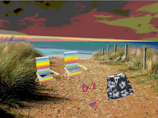
The other is a beginning piece of work to represent my family identity. This will have a few slides, but this first graphic represents the beginning of my life. This contrasts to where I am in my life now in Australia because the city is in the background. It is darker because I am not with my family right now so in a way it is ironic.


The other is a beginning piece of work to represent my family identity. This will have a few slides, but this first graphic represents the beginning of my life. This contrasts to where I am in my life now in Australia because the city is in the background. It is darker because I am not with my family right now so in a way it is ironic.

Friday, May 16, 2008
website hand
So I was tihnking abuot maybe another homepage, or maybe my second page. I just wanted to know what you thought about my original homepage. I wanted to know if you thought that it was not too corny, and if I should include it. Otherwise I created this other photoshop graphic of my hand.


Tuesday, May 13, 2008
Design
Tomorrow in class we are going to begin to put our final project together, but I am still in the process of making some photoshop graphics. I have that good flash idea with the Simpsons but I need to be in class to make it. When the mouse rolls over one of the Simpsons head, not only do I want it to pop up in color, but I also what it to go from small to big. It can expand to maybe most of the page.
The homepage that I posted a few weeks ago is going to be a good start off. I will add rollovers to the beginning page, and maybe some audio. That will be my goal for the first day, to create rollovers on the home page, and hopefully link them to simple secondary pages.
This image below is very interesting how they set up their art. I really like how they put together the different images into circles. They all mean something different. I was able to just isolate the image from the website so I didn't have to do a screen shot, but I like this art.

The homepage that I posted a few weeks ago is going to be a good start off. I will add rollovers to the beginning page, and maybe some audio. That will be my goal for the first day, to create rollovers on the home page, and hopefully link them to simple secondary pages.
This image below is very interesting how they set up their art. I really like how they put together the different images into circles. They all mean something different. I was able to just isolate the image from the website so I didn't have to do a screen shot, but I like this art.

Thursday, May 8, 2008
Simpsons family
So I was looking around on the internet, and got a good idea for a flash application for the website. I realized that the Simpsons have the same amount of family members as I do, as well as the same sexes of the kids (2 girls and 1 boy). I have below a picutre of the Simpsons that I altered with the threshold. Then on the website I'm going to have the color pictures of each of their heads individually pop up over the black and white, and then go back to black and white. Each character will do this separately. I am having trouble with the photoshop on windows though. I cannot figure out how to put one picture on top of another. Can you try to tell me how to do it? Otherwise I like this idea a lot, and am going to try and work on it more in class because the computers are easier to use there. But here is the threshold picture atleast.


Tuesday, May 6, 2008
graphic

This is a continuation from the last post because here is that last graphic from the website that I messed around with to create my own graphic to put on the website.
Monday, May 5, 2008
flash
I found this cool graphic in which I can break up into pieces, and create a flash with the graphic. This design is cool because all of the little squares I can break up and then overlap them more. I can also change the shape of the pieces, as well as add my own flash to them. When the mouse rolls over the pieces the identities can pop up. When I get photoshop on my computer I will be able to play with this graphic more. I had trouble putting it on my computer, so I was unable to mess with it. I think I can become creative with it especially with the new flash that I learned.


Tuesday, April 29, 2008
flash
Today was an assignment to make crazy eyes. I think I really have the hang of simple flash, and this will allow me to create graphs and flash that will help to create my identity more centralized and put together. I can make an animation that combines my 4 identities into one. I am thinking that they can transform from different images into a central image.
This can be easy and help create my identity better also by putting movies, in movies, in movies etc. I'm going to try and spin graphics as a movie, one for each identity on the homepage, an they will merge into one main identity graphic. Next week after being away this weekend, I am going to create images that I will want to merge together to centralize identity.
This can be easy and help create my identity better also by putting movies, in movies, in movies etc. I'm going to try and spin graphics as a movie, one for each identity on the homepage, an they will merge into one main identity graphic. Next week after being away this weekend, I am going to create images that I will want to merge together to centralize identity.
video
In my website I want to include video clips taken from my camera, as well as maybe video clips found on the internet. I was wondering if we could learn how to do this, and include some graphics on top of it also. I want to be able to have a graphic text right near the video, and when you click that, the video will pop up and play.
This part with the video can mostly be used in the part of the website where it is about my adventurous identity, and the identity with my girlfriend. Down below is just the layout of youtube. In a way I want my page to kind of look like this after the graphic is clicked and then the video pops up.

I am excited to also create my own animations and graphics in order to make the website my own, and my own created art as well.
This part with the video can mostly be used in the part of the website where it is about my adventurous identity, and the identity with my girlfriend. Down below is just the layout of youtube. In a way I want my page to kind of look like this after the graphic is clicked and then the video pops up.

I am excited to also create my own animations and graphics in order to make the website my own, and my own created art as well.
Saturday, April 26, 2008
Flash
Now that I have learned flash, I can become creative with different animations to improve the technique of my website. I'm thinking that for my family identity, I can have many animations showing how that identity differs from the others.
Another good thing that I can do with the animations is move my text/graphics around just to be able to make everything on the website more visually entertaining. That is what I am most excited about. I was going to include a lot of text in order to explain the differences in my identities, but by making animated text graphics that makes everything more impressive and entertaining.
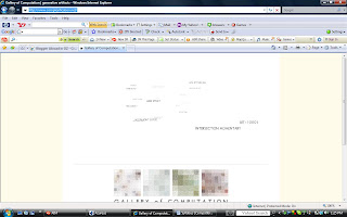
This website that I found (http://www.complexification.net/) have great layering with the varying text. When you scroll your mouse over the different texts the layers change, and the texts get closer or further away. Also when you click on the texts, they get closer, and a picture pops up.
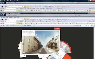
This is another website (http://www.thibaud.be/) that was really cool because of the 3D graphics that change based on where they are clicked on. I like this system, and will try to maybe incorporate that look into my homepage.
Another good thing that I can do with the animations is move my text/graphics around just to be able to make everything on the website more visually entertaining. That is what I am most excited about. I was going to include a lot of text in order to explain the differences in my identities, but by making animated text graphics that makes everything more impressive and entertaining.
This website that I found (http://www.complexification.net/) have great layering with the varying text. When you scroll your mouse over the different texts the layers change, and the texts get closer or further away. Also when you click on the texts, they get closer, and a picture pops up.

This is another website (http://www.thibaud.be/) that was really cool because of the 3D graphics that change based on where they are clicked on. I like this system, and will try to maybe incorporate that look into my homepage.

Tuesday, April 22, 2008
Flash
From my conversation with a peer last week, my website seems to have good ideas and good flow to it. I also have ideas about how to challenge myself especially that I have never done any of web design before. Today we are learning about flash and illustrator, neither of which I have used before. So this will be a new thing to incorporate into my website.
By using flash I was able to drop an "olive" into a martini glass. Frame by frame moving. I was able to also make a ball hit a bat. This we will be doing next week, so I think I am ready to make an animation
By using flash I was able to drop an "olive" into a martini glass. Frame by frame moving. I was able to also make a ball hit a bat. This we will be doing next week, so I think I am ready to make an animation
Monday, April 21, 2008
Homepage and style
It has been a while since the last blog. That is because my parents have been here and I have been traveling with them. But my sister is into creative web design and she gave me a few ideas that I like.
On the left side of the website, I would like to have all the different identities that I have, and when you scroll over them the text will change. I would like to make the text increase and change style as the mouse rolls over. Also I was thinking about adding music to some of my pages. This helps to add design to my website, and take away a little bit from the art.
On my homepage I have those few pictures. When the mouse rolls over those pictures, text graphics will pop up explaining what that identity is in a word or two. This gives me a chance to play around with text, and make it more of a graphic rather than just writing. The graphic does not have to be just on that picture, but it can expand across the whole page just when the mouse rolls over. I was looking at the Bellagio hotel, and the type of rollover that they have is very simple, but they have the general concept of what I want. Rather when you roll over the sections on my website, the text will change more drastically rather than just get high lighted.

I keep trying to think of different ways to improve my website, but not too complicated because I have never done anything with computers like this before. I want to include video as well on the pages to help improve what my identity really is.
On the left side of the website, I would like to have all the different identities that I have, and when you scroll over them the text will change. I would like to make the text increase and change style as the mouse rolls over. Also I was thinking about adding music to some of my pages. This helps to add design to my website, and take away a little bit from the art.
On my homepage I have those few pictures. When the mouse rolls over those pictures, text graphics will pop up explaining what that identity is in a word or two. This gives me a chance to play around with text, and make it more of a graphic rather than just writing. The graphic does not have to be just on that picture, but it can expand across the whole page just when the mouse rolls over. I was looking at the Bellagio hotel, and the type of rollover that they have is very simple, but they have the general concept of what I want. Rather when you roll over the sections on my website, the text will change more drastically rather than just get high lighted.

I keep trying to think of different ways to improve my website, but not too complicated because I have never done anything with computers like this before. I want to include video as well on the pages to help improve what my identity really is.
Tuesday, April 15, 2008
Adjustment Layering
Adjustment laying was the topic of today's lecture. This helped me to combine images more together along with text so that they are no longer just separate and boring. This allows the text to be more like an image and more pleasing to the eye.
Based on different criteria we are having another person in the class listen to our ideas for our website. For example my idea does meet the theme of identity. I have about 4 different identities in my life, and the website will go linear in 4 different ways. I came up with these 4 identities because they are the four main different parts of my life where I have varied identities. I would like to have the website become somewhat organic. But that will all depend on the time that I have to put this site together.
I figure that a flowchart will be easier to describe the way my website is going to run, especially if I want to try and make it somewhat more organic.
Based on different criteria we are having another person in the class listen to our ideas for our website. For example my idea does meet the theme of identity. I have about 4 different identities in my life, and the website will go linear in 4 different ways. I came up with these 4 identities because they are the four main different parts of my life where I have varied identities. I would like to have the website become somewhat organic. But that will all depend on the time that I have to put this site together.
I figure that a flowchart will be easier to describe the way my website is going to run, especially if I want to try and make it somewhat more organic.
Some websites
I found some good websites here to model for my website.

This website above is very simple with the picture on the side and then some text on the left. This is a good general lineup of what my different identity pages will consist of.
This is another good simple example of the setup. The picture and description on the left is simple for me website.
http://www.filtro.com.mx/v2/home.php

My setup of the website is goign to be very simple with the 4 or so links on the homepage to my different identities. Then there will be branches out from there that will be part of each identity. I hope to include text, pictures, animations, music, and anything else that will describe my varied identities in my life.
Below is a draft of the second page for my website that I could not get posted on my last blog.


This website above is very simple with the picture on the side and then some text on the left. This is a good general lineup of what my different identity pages will consist of.
This is another good simple example of the setup. The picture and description on the left is simple for me website.
http://www.filtro.com.mx/v2/home.php

My setup of the website is goign to be very simple with the 4 or so links on the homepage to my different identities. Then there will be branches out from there that will be part of each identity. I hope to include text, pictures, animations, music, and anything else that will describe my varied identities in my life.
Below is a draft of the second page for my website that I could not get posted on my last blog.

Monday, April 14, 2008
Page two
I was unable to do another blog last week because I have been away until today. But on the other blog is the first rough draft page of my website. This page on this blog invovles my scholarly identity. I go to Pennsylvania State at home, and I have my own identity at school. The identity that I have created while in class is very different from any of my other identities.
This identity is very serious, and very concentrated. But throughout my career the identity has been changed drastically. In the beginning I was a pre-vet major, and so my identity was surrounded by students very different from me. They all grew up on farms, and around animals. I had to adjust my identity to fit in with this group in order to be successful in the major. But during my sophomore year I realized that this identity did not work for me. This is when I changed to pre-dental. This major caused me to drastically change my scholar identity. I had to change more to fit in with people that are more like the type of people that I grew up with.
The new identity seemed to fit me better because I feel more comfortable in this skin. I know better where this identity is going to take me, and this identity seems to flow better with my other identities in my life. It revolves better around my life of extreme, with my family, and with my girlfriend. Now the identity has altered somewhat since I have been studying in Australia, and that is a more relaxed identity that is not as serious because I am not taking my core classes. I am taking electives, such as webart design, that will make my identity more well-rounded and universal. This is a rough draft of the page because I had to use powerpoint rather than photoshop.
(I am unable to upload my picture right now because our internet at home is really terrible. I saved it on a hardrive and will edit this post when I get to class tomorrow. So this post was from Tuesday at 1:30 PM)
This identity is very serious, and very concentrated. But throughout my career the identity has been changed drastically. In the beginning I was a pre-vet major, and so my identity was surrounded by students very different from me. They all grew up on farms, and around animals. I had to adjust my identity to fit in with this group in order to be successful in the major. But during my sophomore year I realized that this identity did not work for me. This is when I changed to pre-dental. This major caused me to drastically change my scholar identity. I had to change more to fit in with people that are more like the type of people that I grew up with.
The new identity seemed to fit me better because I feel more comfortable in this skin. I know better where this identity is going to take me, and this identity seems to flow better with my other identities in my life. It revolves better around my life of extreme, with my family, and with my girlfriend. Now the identity has altered somewhat since I have been studying in Australia, and that is a more relaxed identity that is not as serious because I am not taking my core classes. I am taking electives, such as webart design, that will make my identity more well-rounded and universal. This is a rough draft of the page because I had to use powerpoint rather than photoshop.
(I am unable to upload my picture right now because our internet at home is really terrible. I saved it on a hardrive and will edit this post when I get to class tomorrow. So this post was from Tuesday at 1:30 PM)
Subscribe to:
Posts (Atom)